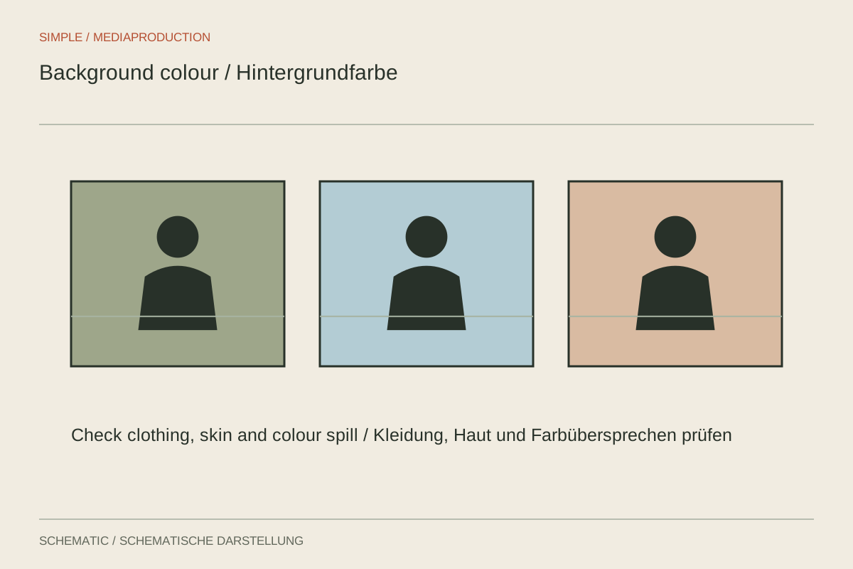
A colour in a small on-screen swatch says little about how a large wall will look behind a speaker. Material, illumination and camera rendering all change its appearance. Choose the background together with clothing and framing. For a conversation, it mainly needs to remain calm and keep the person readable; a striking favourite colour is not automatically appropriate.
Consider brightness before colour names
First compare whether hair and shoulders stand apart from the surface. A navy jumper can merge into dark grey despite their different colour names. A slightly lighter area or a different seating position may help more than stronger saturation. Inspect a small preview too, resembling the eventual phone display.
A white background does not have to be recorded as pure white. Heavy overexposure can compromise edges and pale hair. Conversely, black material in a bright room may reveal creases and reflections. Plan lighting around the intended camera image, rather than the background product's name.
Avoid coloured reflections
When the speaker sits very close to a strongly coloured wall, reflected light can tint skin or pale clothing. Increase the distance and check again. A separate background accent should ideally not also fall on the cheek. Examine this particularly during sideways head movements.
For demonstrations, a saturated background can also influence the perceived colour of the product. A more neutral arrangement makes comparisons between several objects easier. Even when using a brand colour, it should not become more prominent than the demonstration itself.
Consider text and repeatability
Plan the area for names or captions. A calm surface usually gives more flexibility than a pattern with changing brightness. Test actual text at the intended output size instead of merely reserving an empty space. A contrasting panel may be useful when background brightness cannot remain stable.
Keep a short reference video containing the speaker and a neutral card. Record light position and white balance if later episodes need the same appearance. Identical wall paint alone does not guarantee a match: a different angle or exposure can make it appear much lighter, darker or more saturated.